Solution Hub / Product Locker
Stakeholders:
Asurion
Walmart
Target
BestBuy
Staples
Costco
Direct TV
Home Depot
Office Depot
Toys R Us
Sears
Zaps
SIMPLR
Projects:
Solution Hub (SaaS)
Product Locker (SaaS)
Timeline:
September 2013 - December 2016
Disciplines:
User experience
Prototyping
Wireframing
IA (Information Architecture)
User Interaction (IxD)
Tools:
Axure RP Pro
Adobe Photoshop
Adobe Illustrator
Adobe InDesign
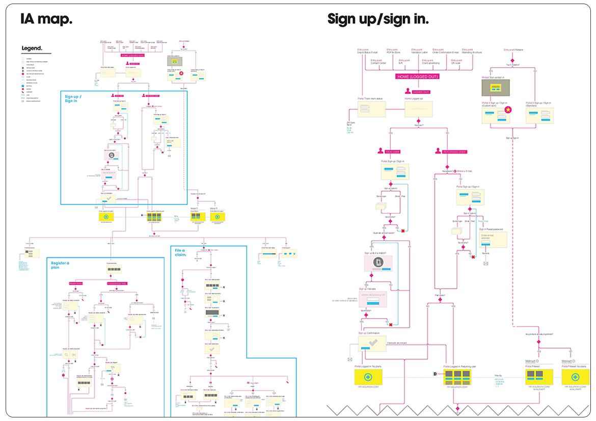
Our team started this massive project by mapping the user journey and creating the information architecture, capturing all possible points of entry into our system. No less than 7 designers were involved in this process, myself included, as we tried to make sure every possible scenario was accurately accounted for.
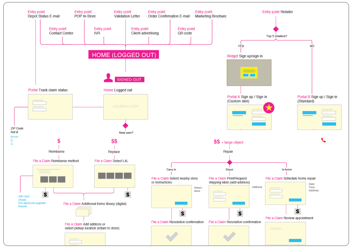
We worked closely with all SMEs (Subject Matter Experts) - representing the top five retailers - as well as developers and business analysts and finally came up with a comprehensive IA Map that served as a starting point for our wireframes.
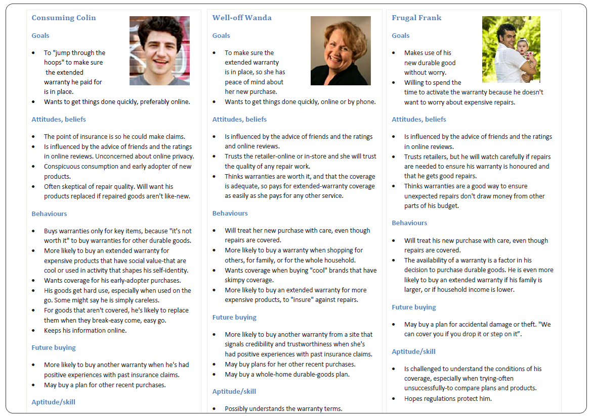
Before jumping into prototyping, we came up with 3 main personas, around which we designed the interactions: Consuming Colin (who's goal was to jump through the hoops to make sure he got his extended warranty), Well-Off Wanda (who was influenced by the advice of friends and online reviews) and finally, Frugal Frank (who was willing to spend the time to activate the warranty, since he didn't want any worries later).
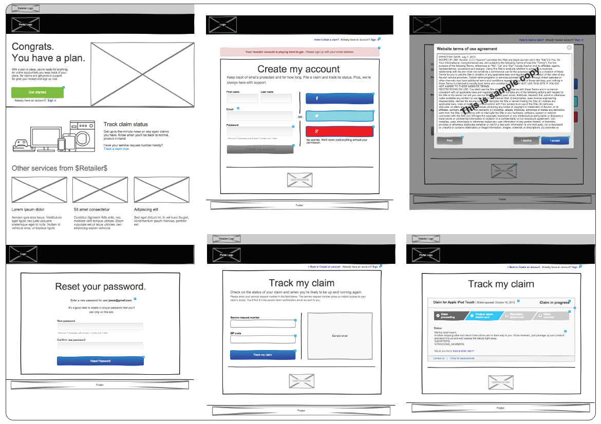
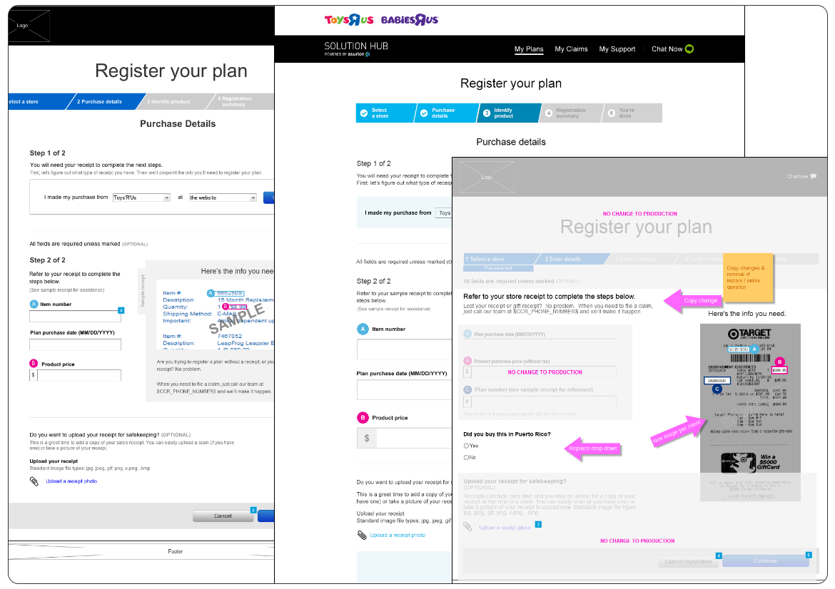
The first order of business was to wireframe the Account Creation of a new user (somebody who purchased an item in-store or online and decided to get extended warranty).
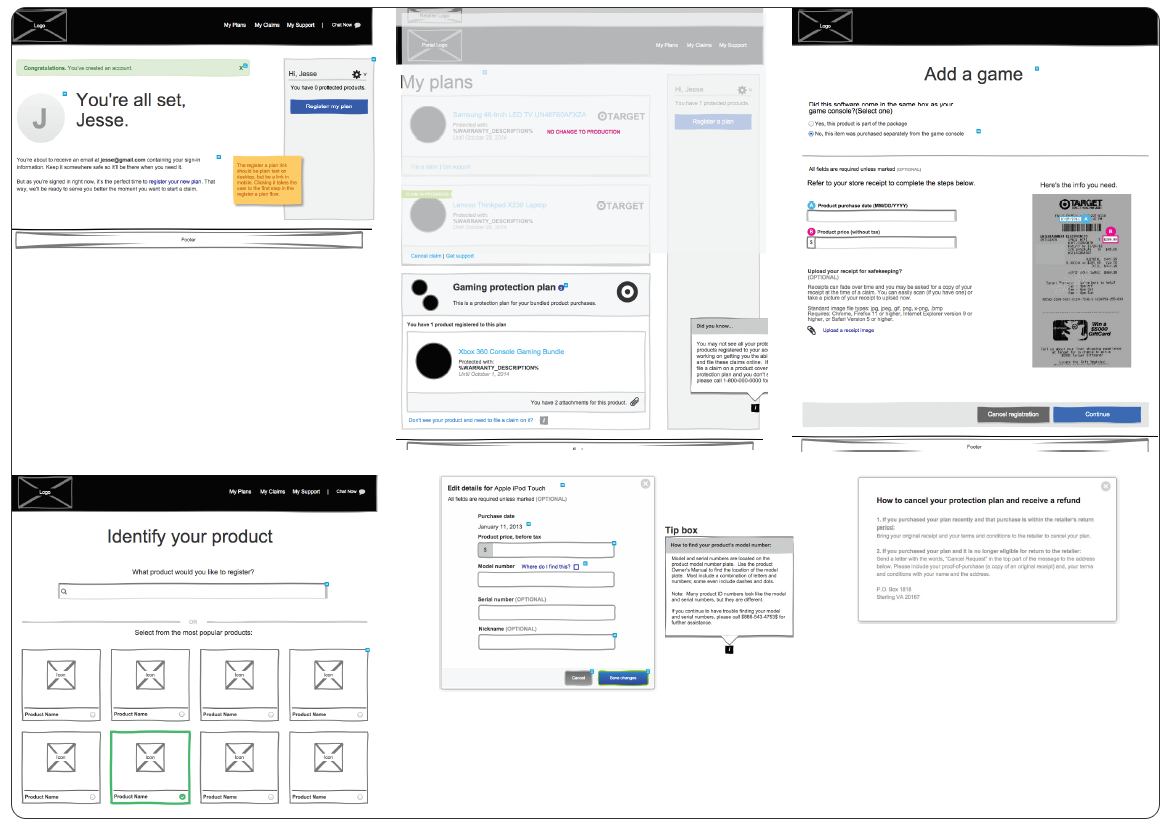
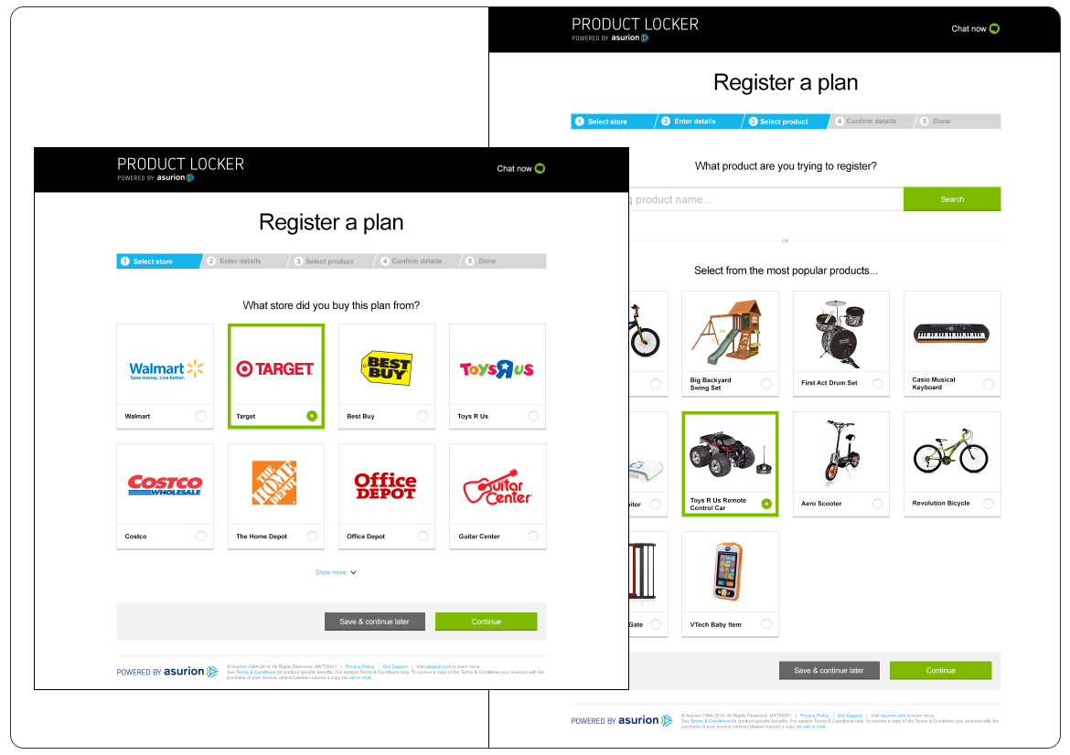
One of the issues we had to find a viable solution for was identifying the product(s) purchased, the location (retailer) and the type of warranty. For instance, a mobile phone can be purchased at Walmart, however may come with a plan provided by Verizon and the extended warranty issued by Walmart's Get Protected, which was backed by Asurion and therefore the item had to be registered through the Solution Hub / Product Locker.
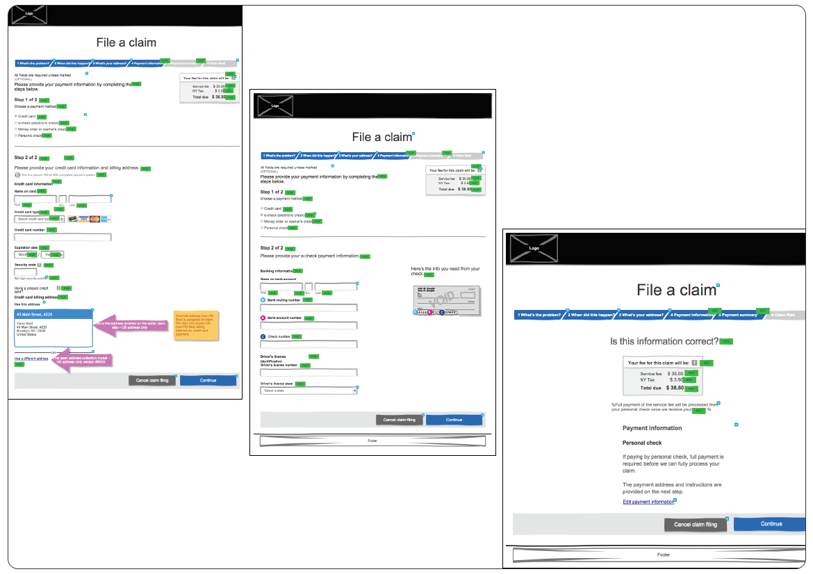
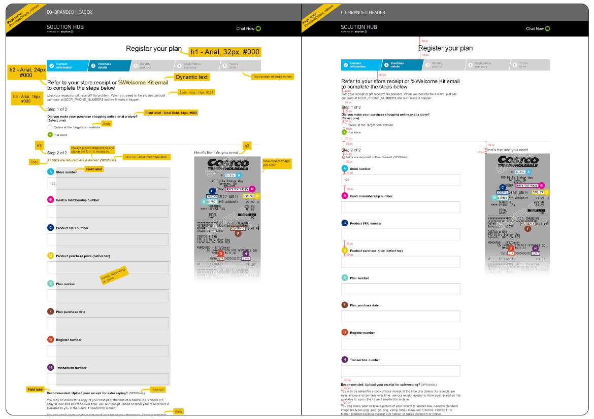
In addition to this, assuming the shopper has kept the original receipt issued by the retailer, we had to find creative ways in which to aid the user find all the necessary information to register the product: the number of the store, membership, product SKU, plan, registration and transaction, in addition to the product and plan purchase dates.
We also designed the option of starting the registration process for one (or more items) and allowing the user to save the details for later. This was very beneficial, as research showed that some shoppers stated the registration process when they purchased the item(s) in store, than continued inputting the details via their smartphone, finishing at a later date using their laptop or PC, either at home or at work.
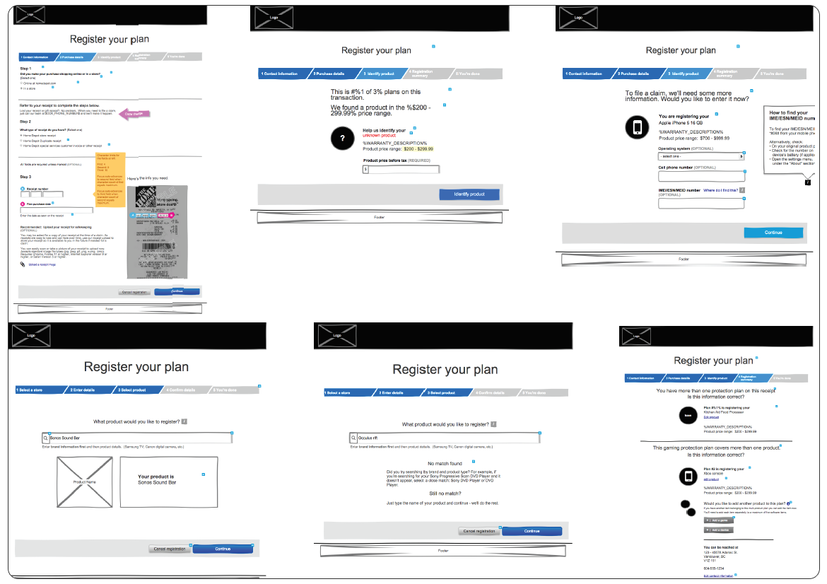
This required designing a consistent process, so that the transition from one step of the registration to another was as seamless as possible. In some cases, a product was added into the system, but could not be identified. This often happened because of a spelling error or items bought in Canada and registered in the US.
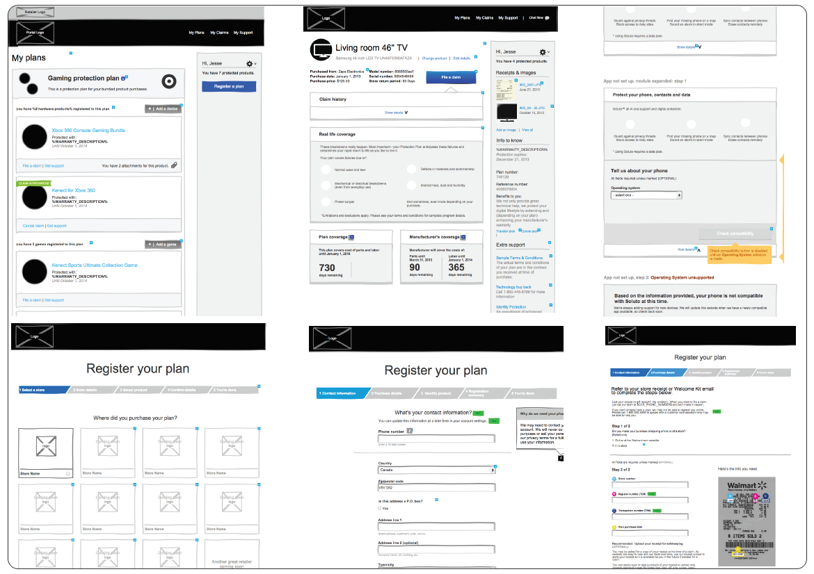
We also had to account for how the shipping address was being read by our system, as Canada Post and USPS have different ways of displaying this type of data, in addition to having Postal Codes (string values) vs. Zip Codes (numeric).
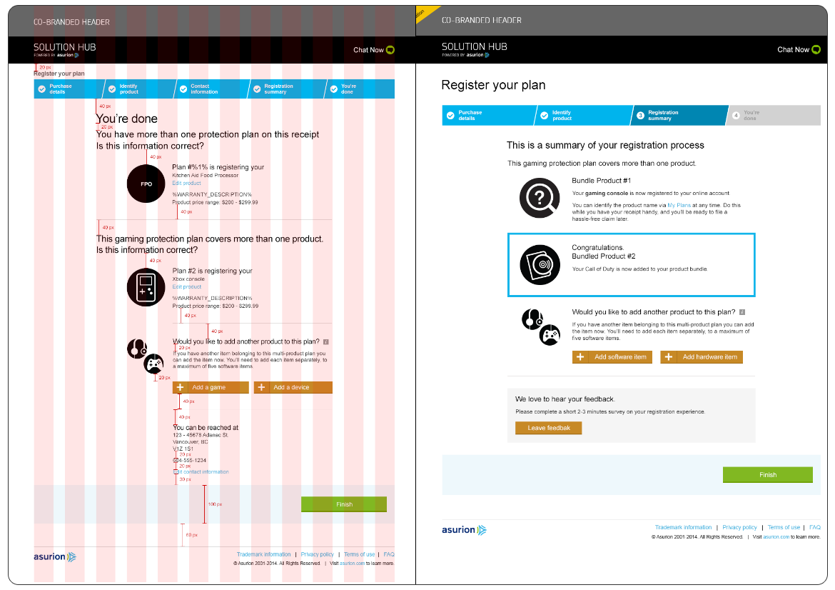
We found very useful to introduce a co-branded header, especially for the Big Five retailers, so that the user knows which "portal" they were in, however this added new layers of complexity, since a user may wanted to register multiple products purchased at different retailers, at the same time.
Also very useful proved to be the introduction of a Progress Bar, labeling the steps in a clear way (Registration Details, Identify Product, Contact Information) so that the user would know what type of information to prepare in advance.
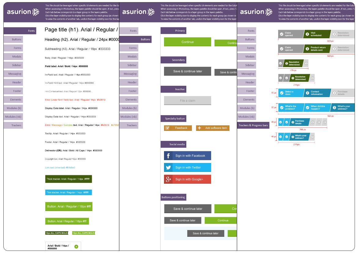
In the end, following the wireframes accordingly, about 200 high-fidelity mockups were produced for every screen and for every stage of the interaction. To ensure that each designer on the team was producing prototypes consistent with the set guidelines, each Photoshop file had to include layers with labels for the fonts used and the distance between each element (using a measuring tool).
Since the design team was in Vancouver and California, while the development teams were mostly on the East Coast (New York, Tennessee), an up-to-date UI Kit was essential in making sure all the work was consistent across the board.