Costco Protection Mobile Web Experience
Stakeholders:
COSTCO
Asurion
Projects:
"Excellence Plus" Mobile Designs
Timeline:
4-5 months
Disciplines:
User Experience
UI Design
Strategy
Tools:
AxurePRO, pen & paper
Adobe Illustrator
Adobe Photoshop
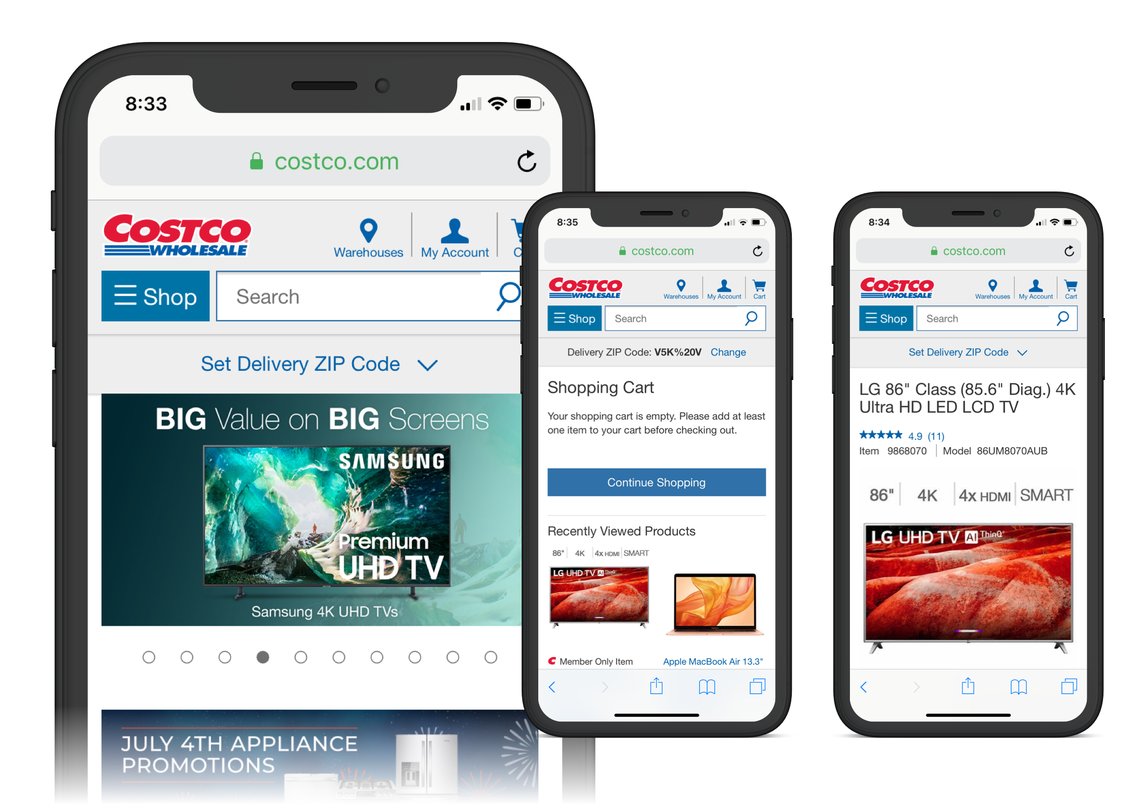
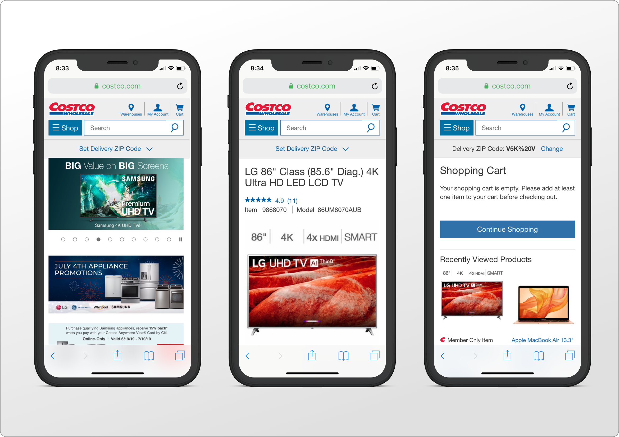
Context
I was part of the team that conducted research, created prototypes, user flows, grid systems, high fidelity mockups and finally, tested the results.
My specific roles were to generate new ideas - through brainstorming, ideation and rapid prototyping exercises (some of which I led myself), to sketch lo-fi wireframes both on papers as well as using AxurePRO, to then translate these prototypes in hi-fi mockups and finally, to test each version in order to better understand which features work best. In addition to this, I was tasked with the creation of the Design System, while at the same time making sure all my colleagues were familiar with the latest elements as they evolved, and they were implementing these deliverables in their work.
Costco's extended warranty program is advertised under the "Excellence Plus" branding, and it's administered by Asurion. It is this section of Costco's mobile and desktop experience that my team worked on.
Goal:
Design a mobile + desktop experience that would seamlessly incorporate into the existing Costco website (and potentially within their mobile app), which informed and enabled the user to purchase additional warranty, without interfering with the item purchasing process.
Challenge #1:
As the process of purchasing extended warranty naturally follows the item purchasing process - which could occur in-store, online or via phone - the first challenge was to create a flawless journey for the user in acquiring additional protection for the product, no matter what the point of purchase was and regardless of whether or not they continued this journey in-store, online or via phone, or through a combination of steps.
Challenge #2:
The second challenge was dealing with the potential customer's "buyer's remorse" (which is the sense of regret after having made a purchase) and which is frequently associated with the purchase of an expensive item. Buyer's remorse is believed to stem from cognitive dissonance, and therefore, adding an extra step or even worse, a sequence of steps, in order to add an extra expense for the extended warranty, might have the unintended consequence of the customer abandoning the whole purchase altogether.
It took a lot of finesse to create a process that not only didn't add to the buyer's remorse, but enhanced the shopper's experience overall. Provide little or unclear information, and the customer would not be convinced why they need to spend extra on purchasing protection. Provide too much information and visual clutter, and the customer could easily be overwhelmed by the whole process, thus abandoning the purchase (which carried the potential risk of having the customer not returning for a long time or using a competitor's services).
Rapid prototyping
One of the initial steps in the process was to sketch a few key ideas on paper and share them with our team and the stakeholders. Introducing the main sections as clickable tabs, rather than having them all on one long page, was one of the proposals. These sections were highlighting the fact that Costco's Care Plan offers real protection (or reimbursement, if not possible to replace or repair), showing what a typical manufacturer's warranty covers versus the comprehensible plan offered by Costco.
This enabled us to quickly test our ideas and gather insights into the effectiveness of the design.
We looked at the existing color scheme used by Costco at that time, plus their overall design trend, and we came up with two main versions: V1 adopted a more colorful and traditional design (where all the information was presented on one long page) and the more streamlined V2 (where the information was shown using the progressive disclosure pattern).
Pen & paper
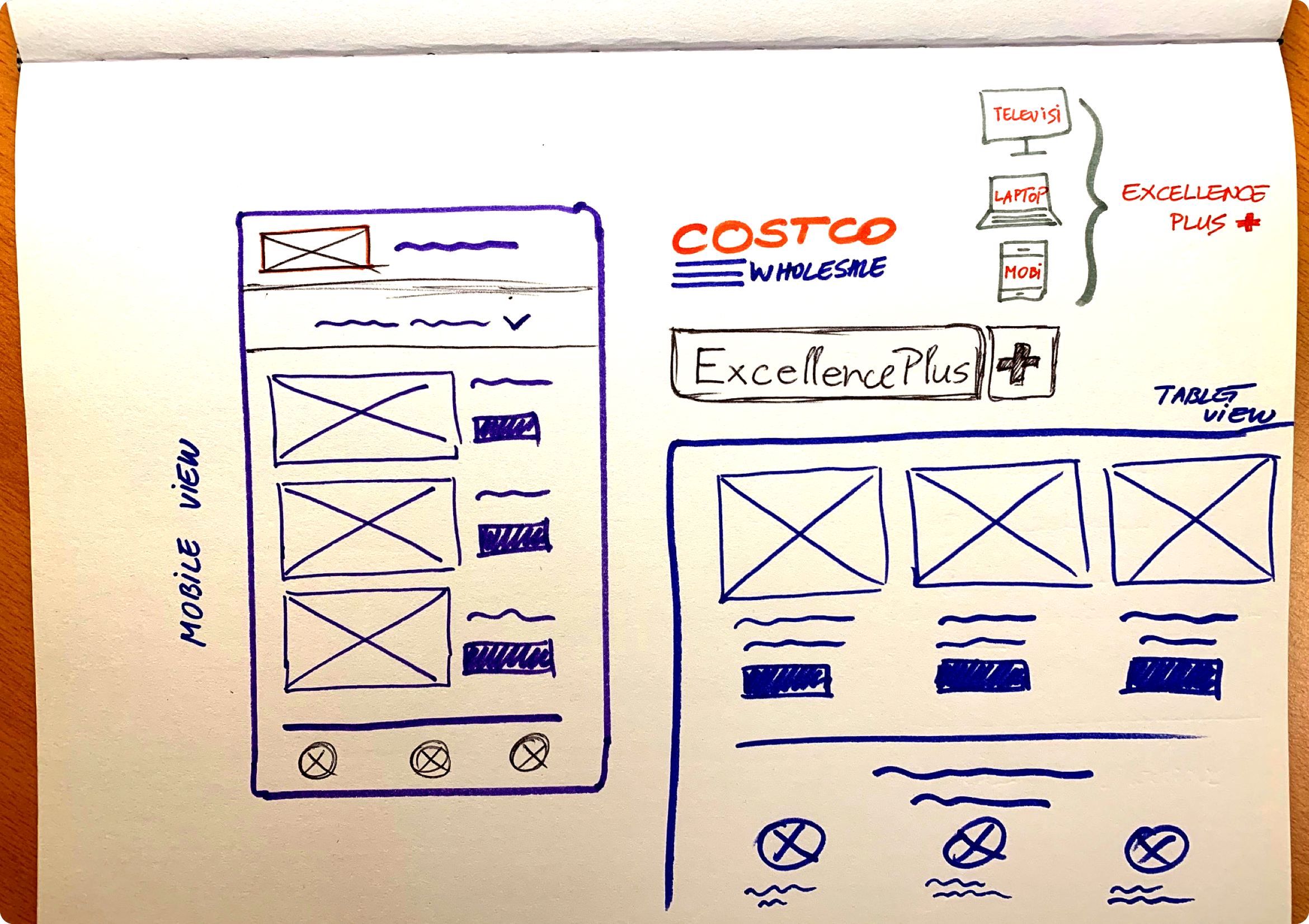
One of the initial steps in the process was to sketch a few key ideas on paper and share them with our team and the stakeholders. Introducing the main sections as clickable tabs, rather than having them all on one long page, was one of the proposals. These sections were highlighting the fact that Costco's Care Plan offers real protection (or reimbursement, if not possible to replace or repair), showing what a typical manufacturer's warranty covers versus the comprehensible plan offered by Costco.
Lo-fi sketches
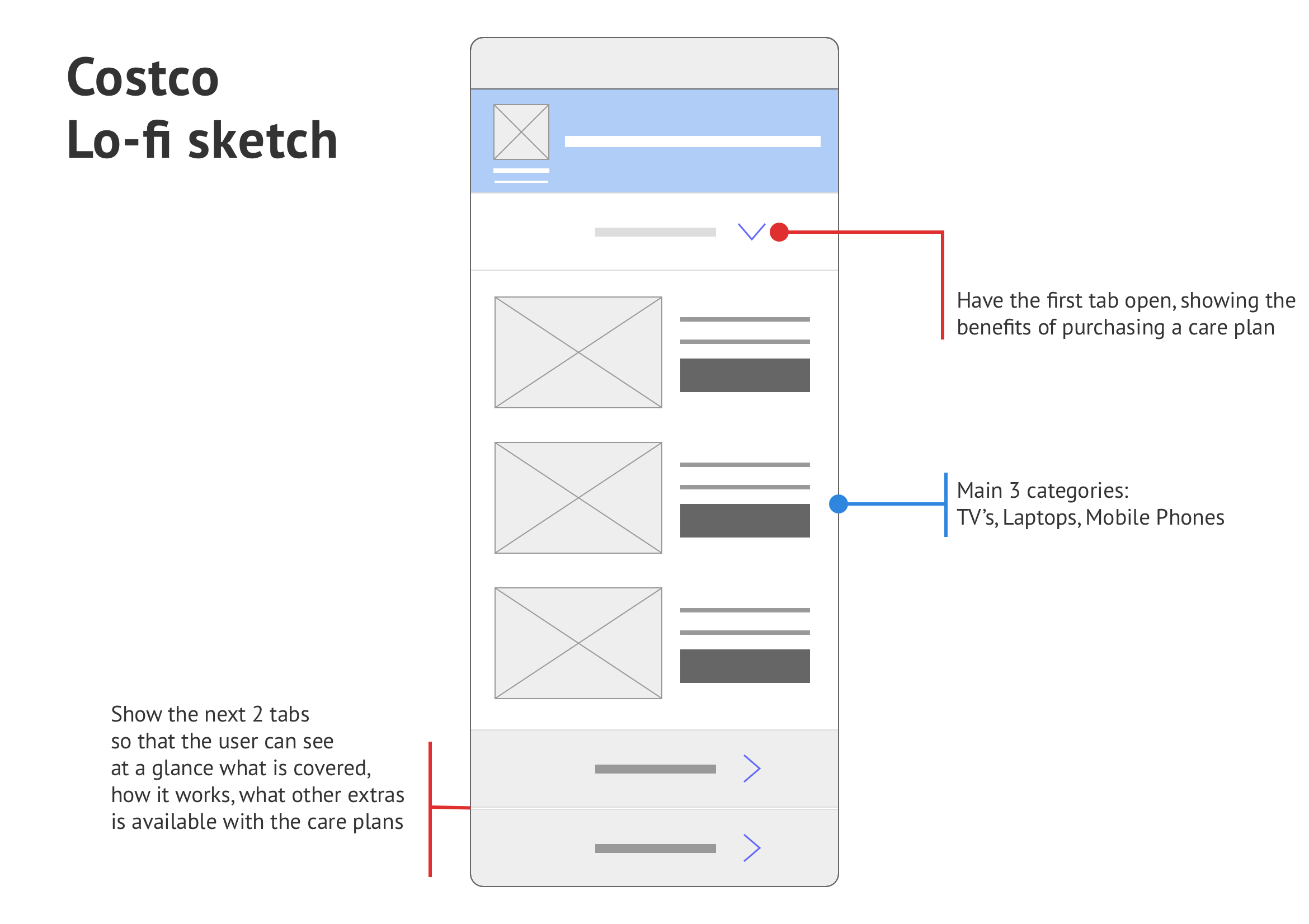
One of the initial steps in the process was to sketch a few key ideas on paper and share them with our team and the stakeholders. Introducing the main sections as clickable tabs, rather than having them all on one long page, was one of the proposals. These sections were highlighting the fact that Costco's Care Plan offers real protection (or reimbursement, if not possible to replace or repair), showing what a typical manufacturer's warranty covers versus the comprehensible plan offered by Costco.
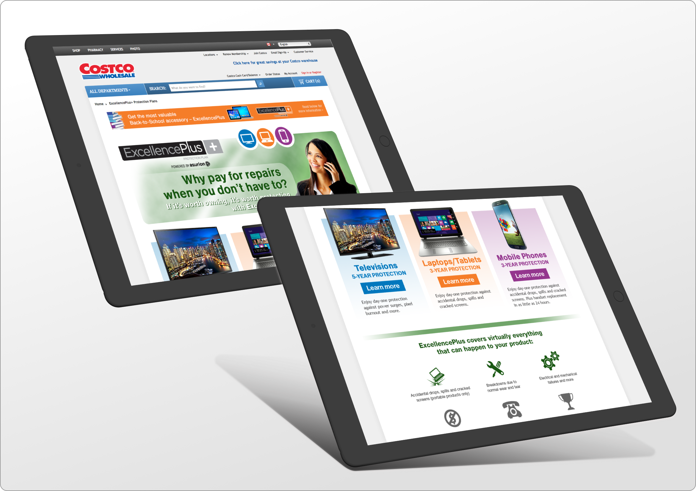
Hi-fi mockups, V1
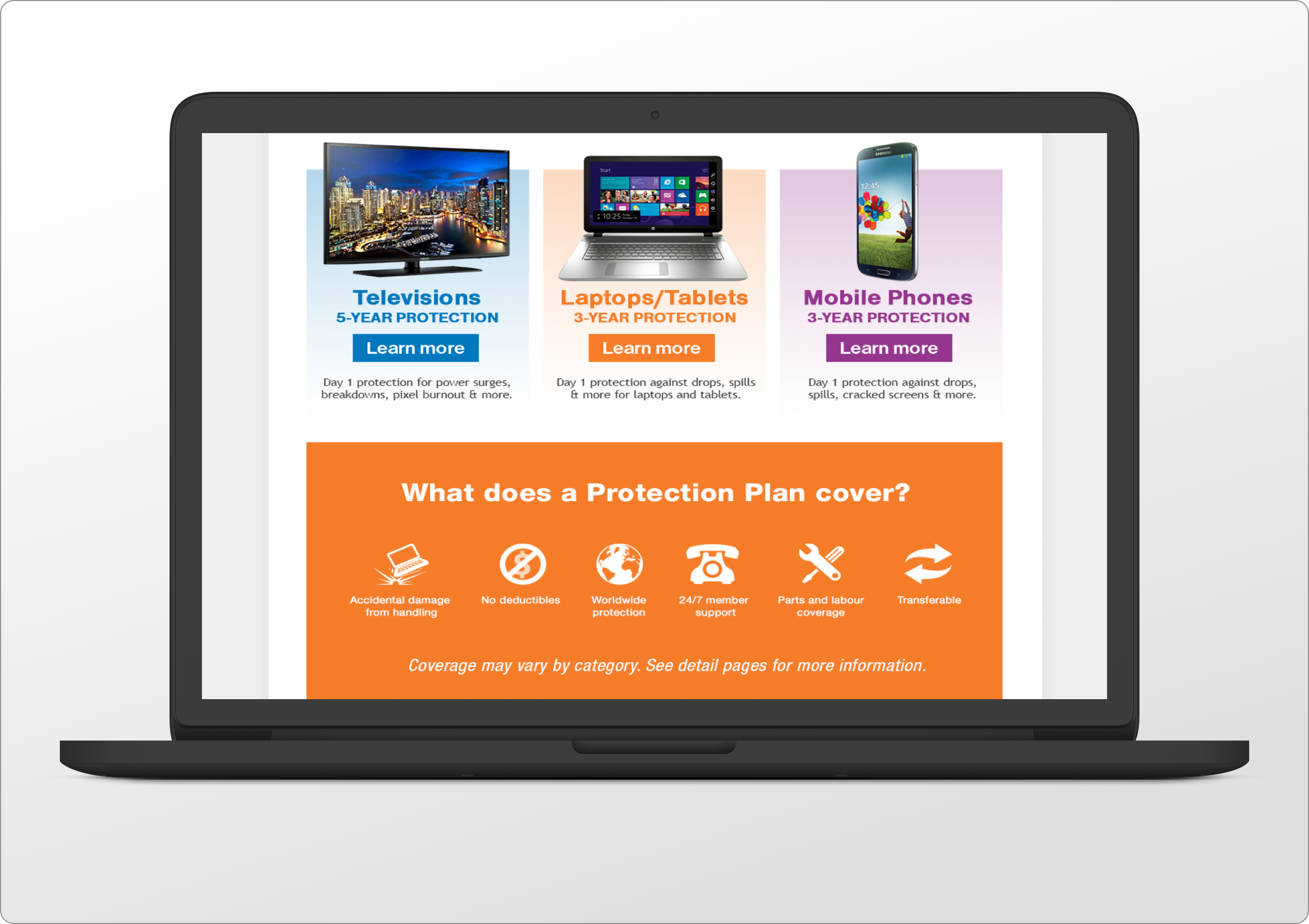
Back to the first version of our design, we presented all the information on one long page, using bold colors to create a clear distinction between each section of the Product Care Plan landing page. You can see below a screenshot of the website as seen on a large screen, as well as the mobile version of it.
Testing and Next Steps
Right from the get-go, although this design was very popular with some of the stakeholders, we noticed that users were getting overwhelmed by the amount of information displayed and the many bold sections presented in equally bold colors. It seemed like a daunting task to try to take in all that information, while still dealing with the emotions associated with a large purchase.