Target Protection Mobile Web Experience
Stakeholders:
TARGET
Asurion
Projects:
"Make Protection Happen" Mobile Designs
Timeline:
4-5 months
Disciplines:
User Experience
UI Design
Strategy
Tools:
AxurePRO
Adobe Illustrator
Adobe Photoshop
Project description
As a UX/UI designer at Asurion, I was part of the team that conducted the research, created the prototypes & user flows and the high fidelity mockups and finally - tested and presented the results.
My specific roles were to generate new ideas - through brainstorming, ideation and rapid prototyping exercises (some of which I led myself), to sketch lo-fi wireframes both on papers as well as using AxurePRO, to then translate these prototypes in hi-fi mockups and finally, to test each version in order to better understand which features work best. In addition to this, I was tasked with the creation of the Design System, while at the same time making sure all my colleagues were familiar with the latest elements as they evolved, and they were implementing these deliverables in their work.
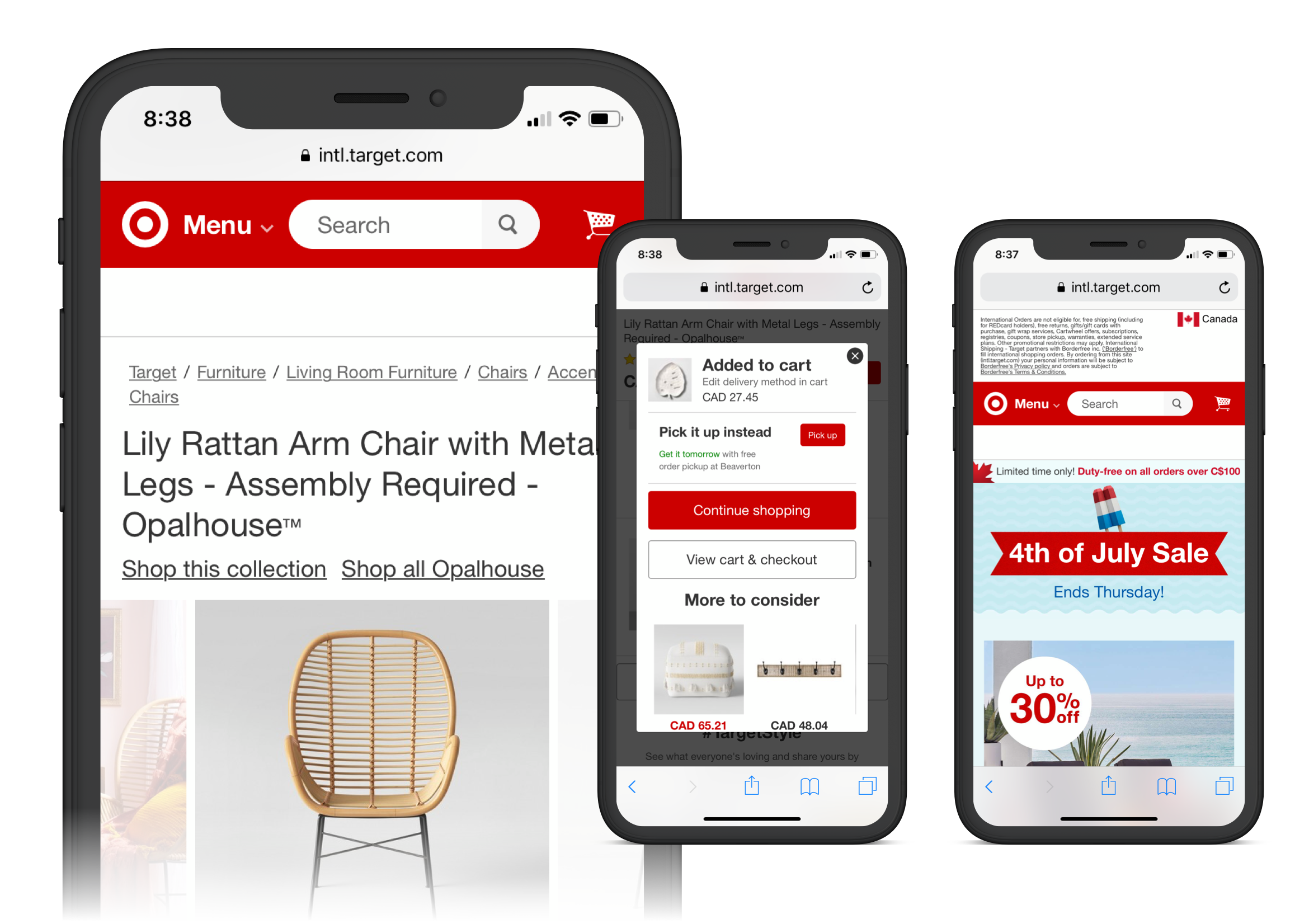
Target's extended warranty program is advertised under the "TARGET Protect" branding, and it's administered by Asurion. Sometimes also known as "Make Protection Happen", it is this section of Target's mobile and desktop experience that my team worked on.
Goal:
Design a mobile + desktop experience that would seamlessly incorporate into the existing Target website (and potentially within their mobile app), which informed and enabled the user to purchase additional warranty, without interfering with the item purchasing process.
Challenge:
As the process of purchasing extended warranty naturally follows the item purchasing process - which could occur in-store, online or via phone - the first challenge was to create a flawless journey for the user in acquiring additional protection for the product, no matter what the point of purchase was and regardless of whether or not they continued this journey in-store, online or via phone, or through a combination of steps.
Paper and lo-fi sketches
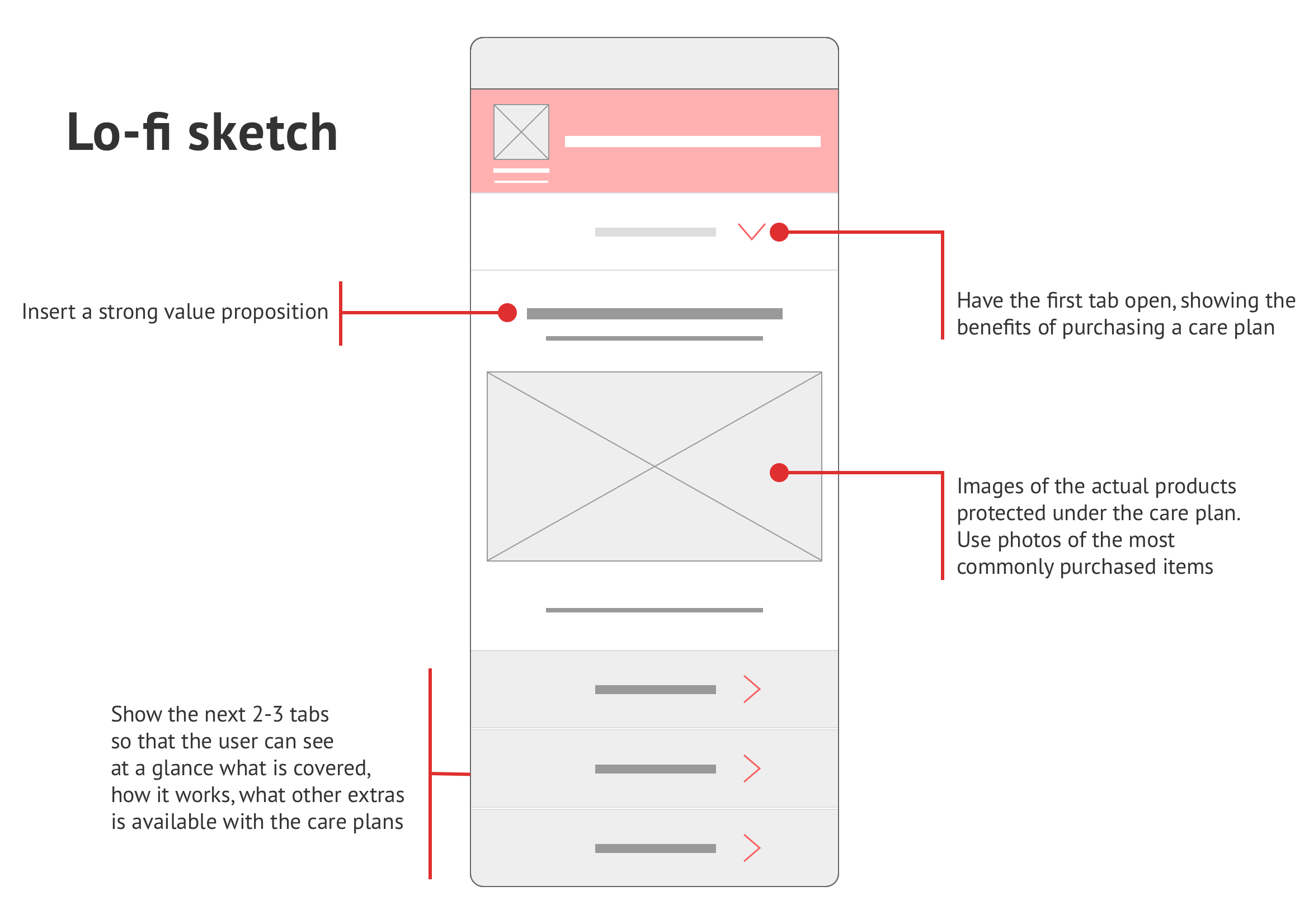
One of the initial steps in the process was to sketch a few key ideas on paper and share them with our team and the stakeholders. Introducing the main sections as clickable tabs, rather than having them all on one long page, was one of the proposals. These sections were highlighting the fact that Target's Care Plan offers real protection (or reimbursement, if not possible to replace or repair), showing what a typical manufacturer's warranty covers versus the comprehensible plan offered by TARGET.
This enabled us to quickly test our ideas and gather insights into the effectiveness of the design.
We looked at the existing color scheme used by Target at that time, plus their overall design trend.
Rough sketches on paper
One of the initial steps in the process was to sketch a few key ideas on paper and share them with our team and the stakeholders. Introducing the main sections as clickable tabs, rather than having them all on one long page, was one of the proposals. These sections were highlighting the fact that Target's care plan offers real protection (or reimbursement, if not possible to replace or repair), showing what a typical manufacturer's warranty covers versus the comprehensible plan offered by Target.
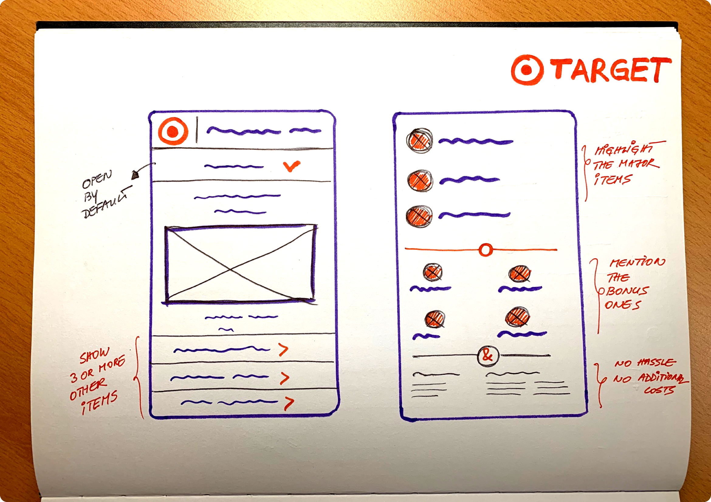
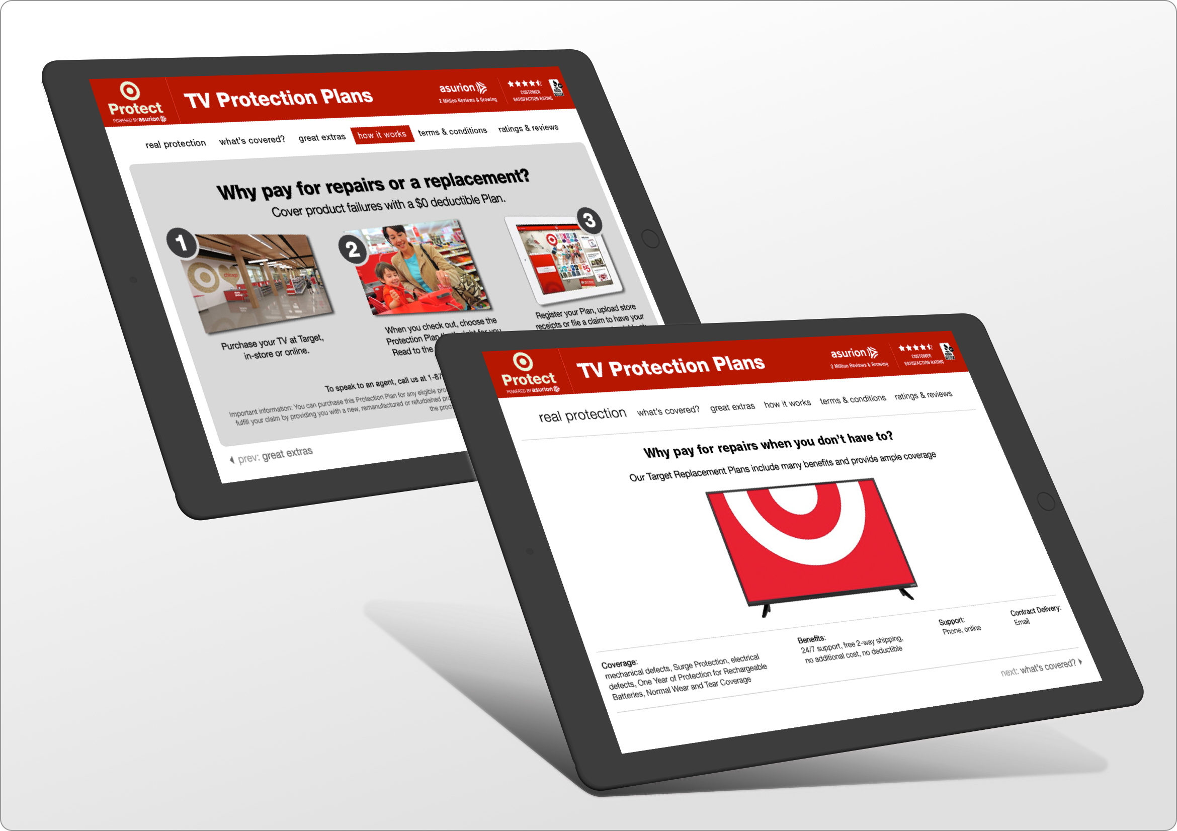
Tablet view, Version One
One of the initial steps in the process was to sketch a few key ideas on paper and share them with our team and the stakeholders. Introducing the main sections as clickable tabs, rather than having them all on one long page, was one of the proposals. These sections were highlighting the fact that Target's care plan offers real protection (or reimbursement, if not possible to replace or repair), showing what a typical manufacturer's warranty covers versus the comprehensible plan offered by Target.
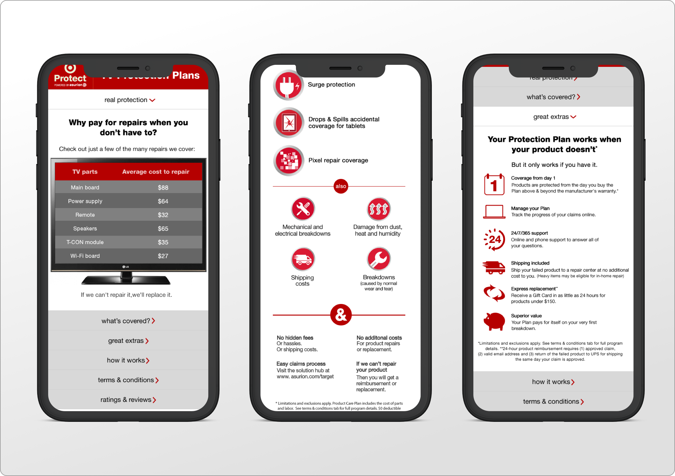
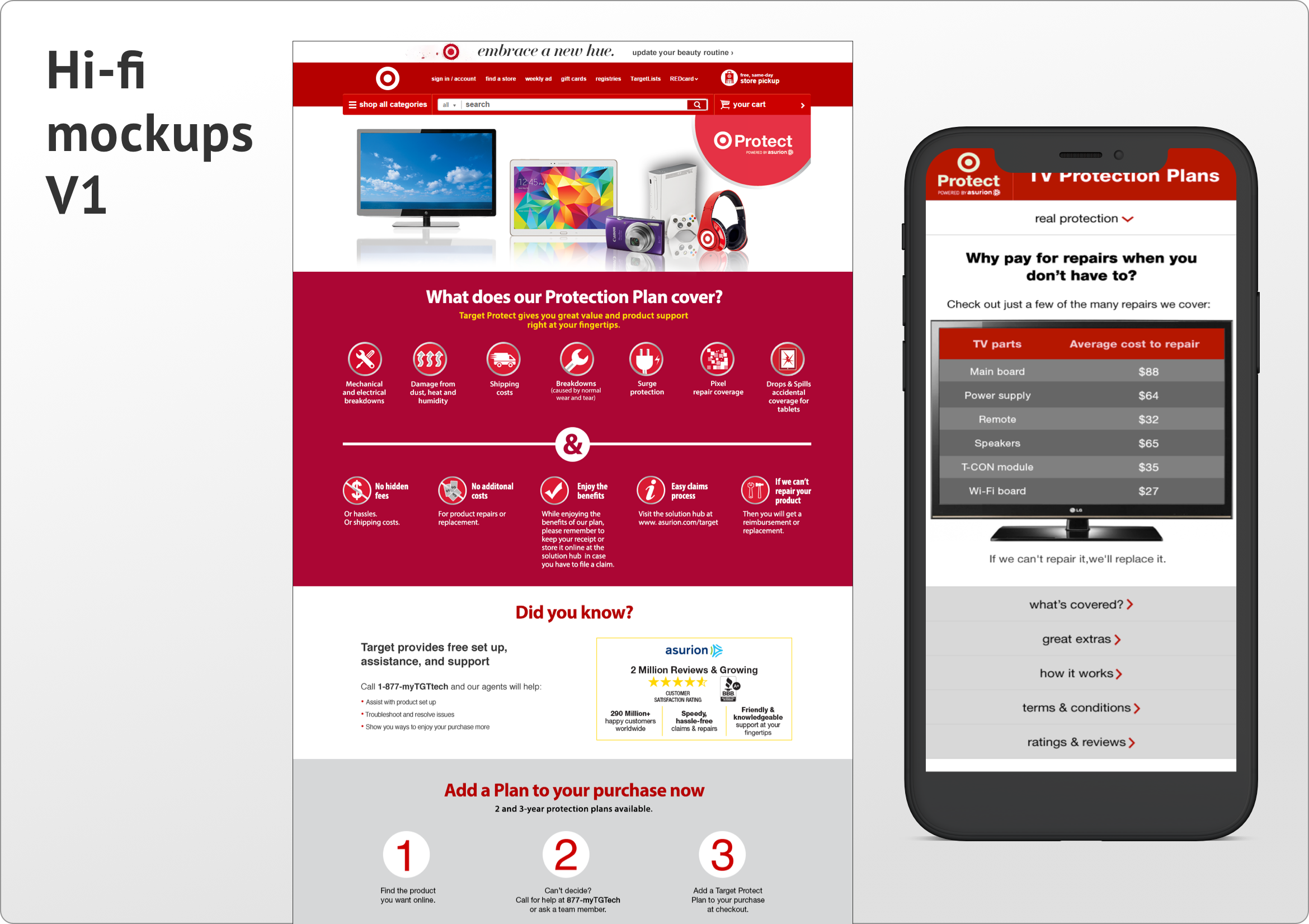
Hi-fi mockups, V1
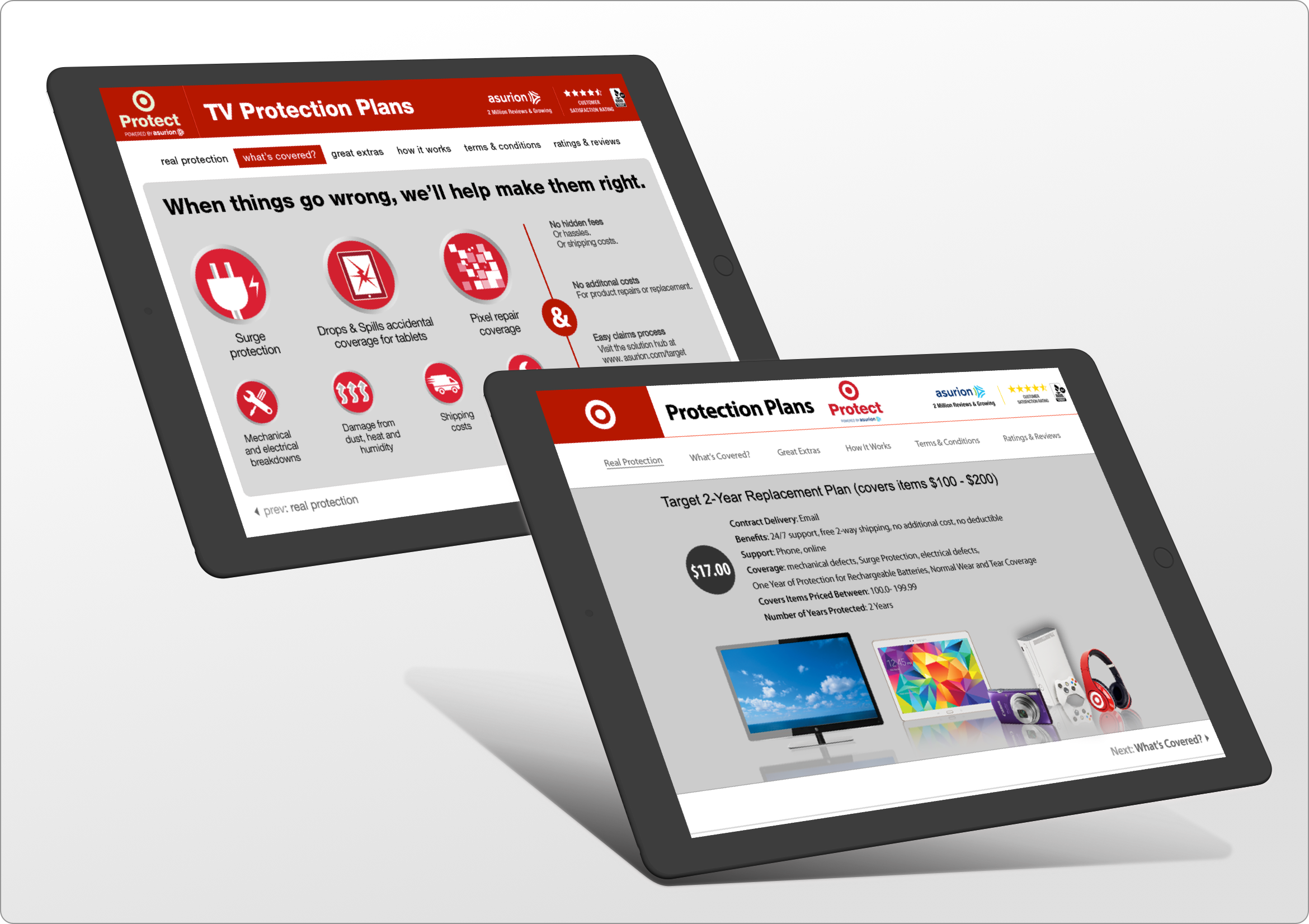
Back to the first version of our design, we presented all the information on one long page, using bold colors to create a clear distinction between each section of the Product Care Plan landing page. You can see below a screenshot of the website as seen on a large screen, as well as the mobile version of it.
Testing, round one
Right from the get-go, although this design was very popular with some of the stakeholders, we noticed that users were getting overwhelmed by the amount of information displayed and the many bold sections presented in equally bold colors. It seemed like a daunting task to try to take in all that information, while still dealing with the emotions associated with a large purchase.
Key findings
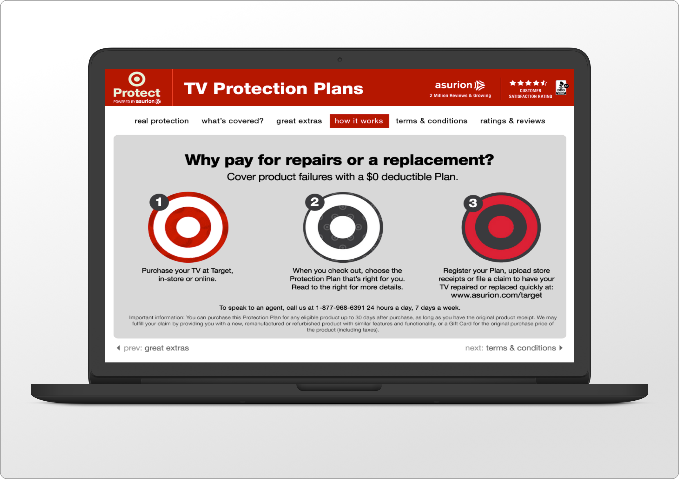
Above and below, one can see the laptop / landscape tablet view of the initial version tested, with the main menu at the top, clearly highlighting each section the user was viewing, while also displaying bold links at the bottom for the previous and the next section. As "playful" and interactive as this design was, we decided to go ahead and develop the second version of the following reasons:
• The myriad of colors distracted the user from the content
• Having all the information displayed on one page was too much to digest for even the most ambitious users
• Some modules (like the Select Product Category on V1 hi-fi mockup) were antiquated and not suitable for a responsive design
Developing V2
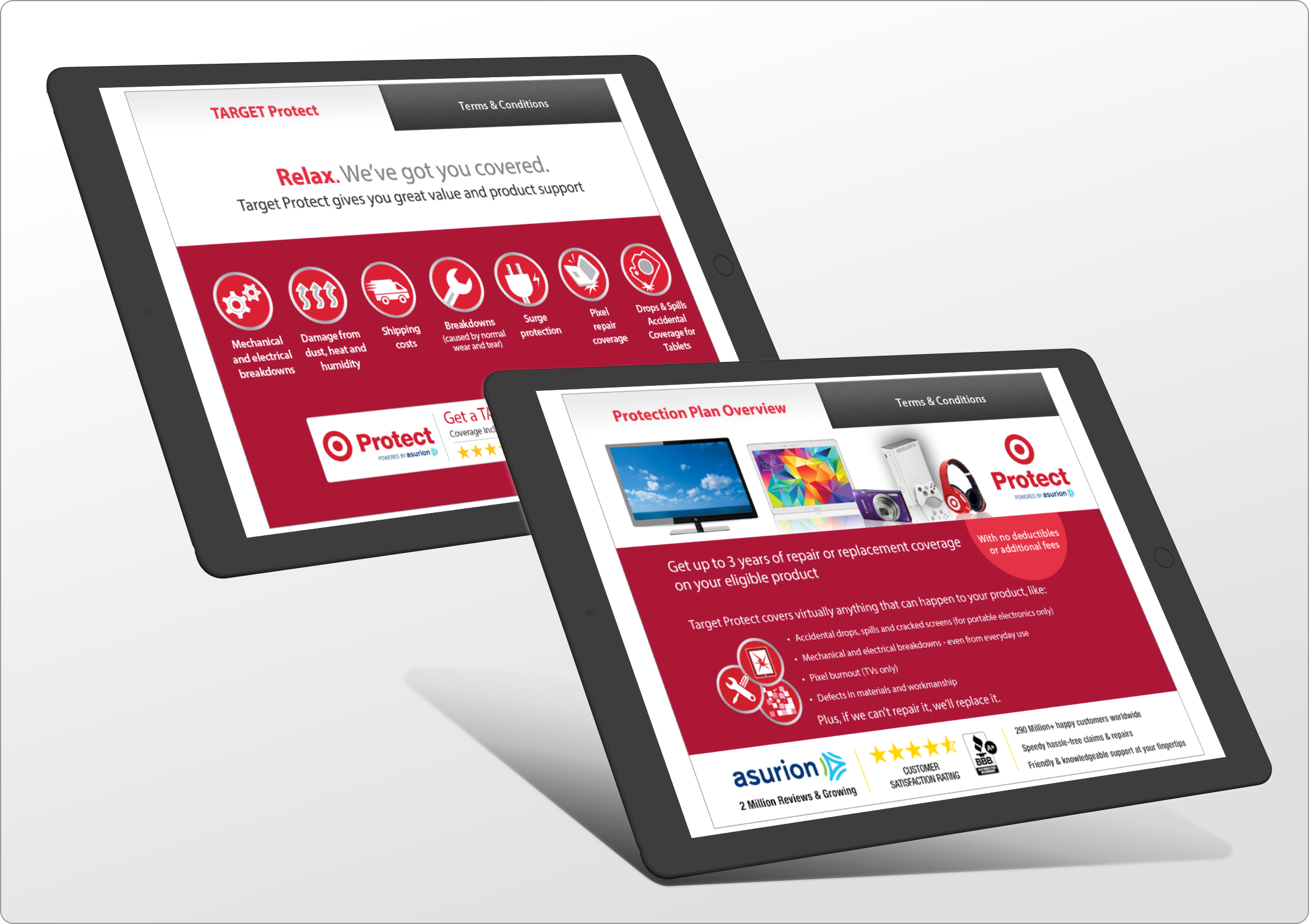
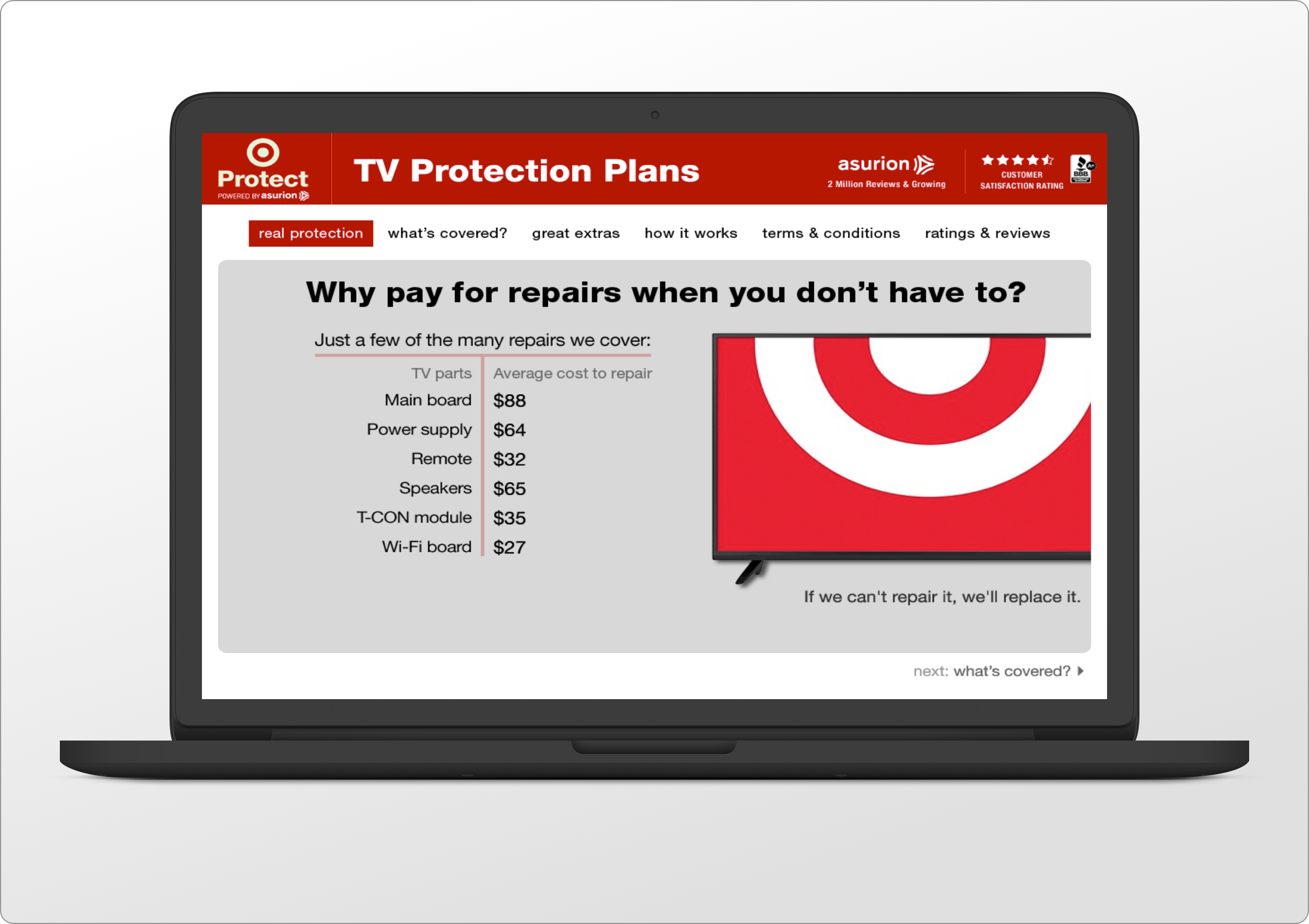
With the second version, we managed to convince the stakeholders to adopt a mobile-first approach. The first order of business was to divide the main sections into clickable tabs, with the first one open (Real Protection) when the user landed on this page. As one can see from the Lo-fi sketches and paper drawings above, a strong value proposition and a catchy tag line would frame photos of the most commonly purchased items in that category.
Testing V2, mobile + tablet views
Although the structure for version two was similar to V1 (at least in the landscape tablet view), the cleaner and more streamlined designed proved to be very efficient with users in completing the assigned tasks and digesting the information (which was now split in bite-size, easy to read chuncks), while also being supported by relevant images, graphics and icons.
Key findings
The gentle tones and soft overall design in general, and the use of crafty icons to highlight the products and services in particular, proved to be a major success. More customers were engaging in the process of learning more about the care plans, clicking through all the sections and finally, purchasing extended warranty for their items.
Conclusion
Having to design a unified experience for such a wide variety of personas and customers, keeping in mind all their considerations, attitudes, beliefs, behaviours and pain points was definitely one of the most challenging parts of the project. Also, since our office was located in Vancouver, BC while the customers were from all over North America (including Hawaii and Alaska), testing was only possible via phone or video conference.